
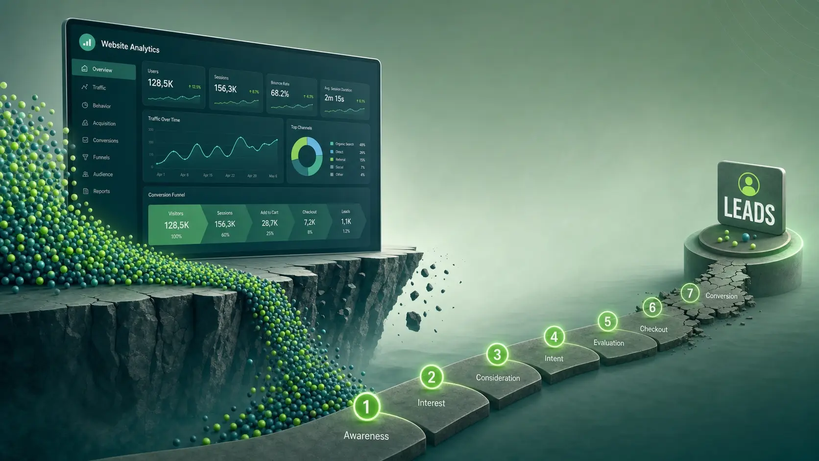
Traffic without leads usually means the site is doing one job well and failing at the next one. Visitors arrive, scan quickly, feel uncertain, and leave before taking any meaningful action. Fixing conversion gaps is often faster and cheaper than chasing more clicks.
What To Check First When Traffic Does Not Convert?
 Start with the simple question your visitor is silently asking. What is this business, who is it for, and what should I do next. If the page does not answer those in seconds, most users will bounce.
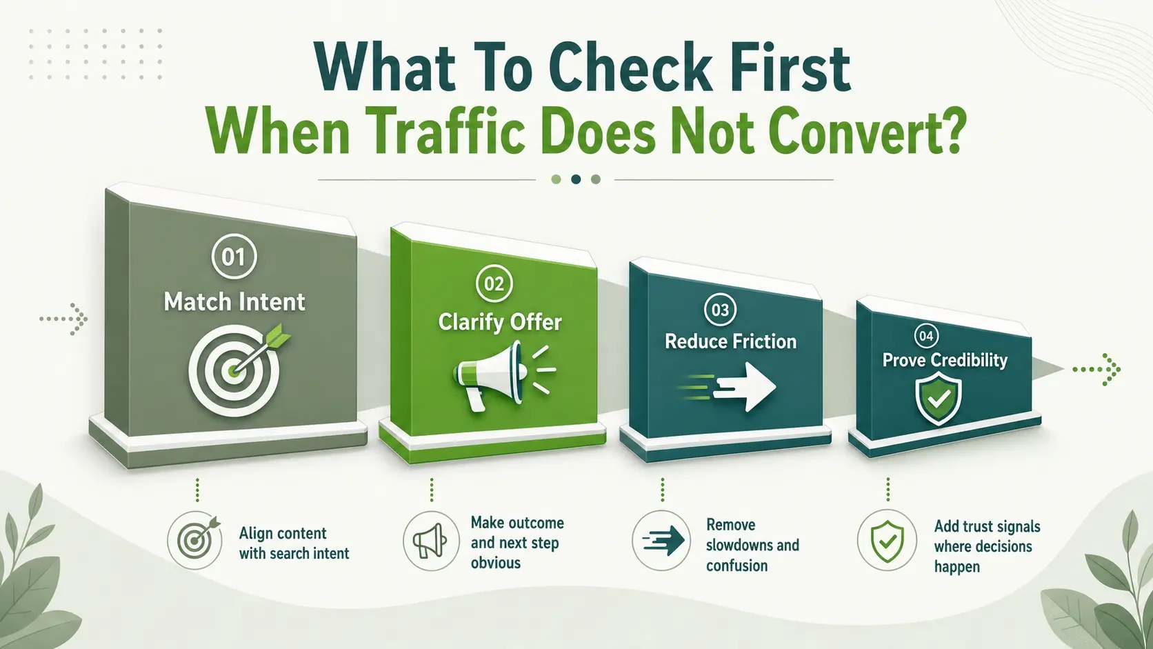
Conversion work should follow the funnel. Match intent, clarify the offer, reduce friction, then build trust and improve speed. Track changes with clean analytics so improvements are measurable.
- Match Intent: Align the landing page content with the search query and ad promise.
- Clarify The Offer: Make the outcome and next step obvious above the fold.
- Reduce Friction: Remove anything that slows users down or confuses them.
- Prove Credibility: Add trust signals where the user is deciding.
Once these fundamentals are in place, the eight problems below become easier to spot and fix.
Weak Value Proposition Above The Fold
If the first screen looks like a generic brochure, users hesitate. They need a clear outcome, a clear audience, and a clear reason to believe you can deliver. Without that clarity, visitors keep browsing or exit.
Make the hero section specific. Use a primary headline that states the result, a subheadline that explains who it helps, and a single primary call to action. Keep the design clean so the message, not the decoration, gets attention.
- Outcome First Copy: State what changes for the customer, not what the company does.
- Audience Clarity: Name the industry, role, or problem so the right visitors self identify.
- Single Primary Action: Pick one main CTA and support it with one secondary option.
After the fold reads clearly, move on to the path users take to reach the conversion point.
Unclear Navigation And Page Flow
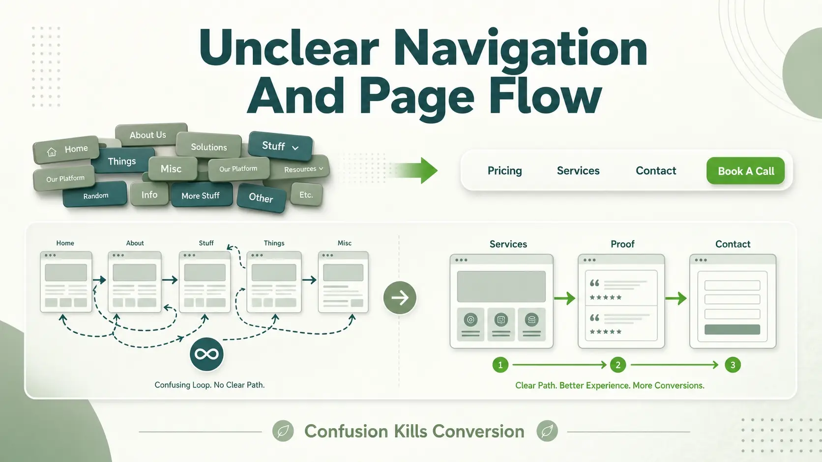 Visitors convert when the path feels simple. If menus are crowded, labels are vague, or pages feel disconnected, users lose context. Confusion is a conversion killer, even when the offer is strong.
Streamline navigation to guide users to the next logical step. Ensure every high intent page has a clear progression, such as services to proof to contact, or product to benefits to demo. Keep internal links purposeful and avoid sending users in loops.
- Reduce Menu Choices: Keep only the pages that support decision making.
- Use Familiar Labels: Prefer words users expect, like Pricing, Services, Contact, or Book A Call.
- Design For Skimming: Use short sections, meaningful subheads, and consistent spacing.
A cleaner flow sets up the next critical element, the call to action itself.
Calls To Action That Are Easy To Miss
Many sites bury the CTA or vary it so much that users never learn what to click. If buttons change labels across pages, the experience feels inconsistent. If CTAs are passive, users may not feel invited to act.
Use one primary CTA phrase across the site for the main goal, such as Book A Consultation or Request A Quote. Place it where users naturally pause, including above the fold, after key benefit sections, and at the end of the page. Use contrast and whitespace so it is clearly tappable on mobile.
- Consistent CTA Language: Repeat the same primary action so it becomes familiar.
- Multiple Natural Placements: Add CTAs after benefits, proof, and pricing context.
- Mobile Friendly Buttons: Make the tap target large with clear spacing.
Even a perfect CTA fails if the offer itself is hard to understand.
Offer And Pricing That Feel Vague
Visitors need to know what they get and what happens next. If services are described in broad terms, users cannot compare options or justify a call. If pricing is hidden, users may assume it is too expensive or complicated.
Add concrete deliverables and clear scope boundaries. If you cannot publish full pricing, share ranges, starting points, or what affects cost. State timelines, what is included, and what is not included so expectations are set before a lead ever reaches your inbox.
| Conversion Signal | What Visitors Need To See | Quick Fix |
|---|---|---|
| Service Clarity | Defined deliverables and scope | Add a short list of inclusions and exclusions |
| Pricing Confidence | Range or starting point and cost drivers | Share a from price and 3 factors that change it |
| Next Step Certainty | What happens after form submission | Explain response time and meeting flow |
| Fit Screening | Who it is best for and not for | Add a simple fit checklist near the CTA |
Once the offer is clear, focus on the moment of conversion, the form or booking step.
Forms That Create Friction
Long forms feel risky and time consuming. Each extra field increases drop off, especially on mobile. Confusing validation errors or unclear required fields also cause users to abandon.
Ask only what you need to start the conversation. Use smart defaults, clear field labels, and a short privacy reassurance. If qualification is important, move deeper questions to the next step after a lead submits.
- Reduce Required Fields: Name, email, and one context field is often enough.
- Make Errors Obvious: Show inline validation and explain what to fix.
- Add Micro Trust: Include a brief note about not sharing contact details.
If the form is smooth and still no one submits, the issue may be trust.
Lack Of Trust Signals
Visitors hesitate when they cannot verify legitimacy quickly. Thin testimonials, missing company details, or outdated design cues reduce confidence. Trust must be present at the exact point of decision, not only on an about page.
Add proof where users are evaluating risk. Include real client outcomes, recognizable certifications, clear contact information, and a visible privacy policy link in the footer. If you serve local markets, show location details and consistent business identity across the site.
- Specific Testimonials: Use short quotes that mention the problem and result.
- Visible Company Details: Add address, phone, and business email where appropriate.
- Professional Proof: Display certifications, associations, and compliance statements.
Trust can be lost even faster when the site performs poorly, especially on mobile.
Slow Site Speed And Mobile Issues
 Users interpret slowness as unreliability. If pages take too long to load, the visitor may never see your offer. On mobile, cramped layouts, sticky popups, and tiny buttons make conversion feel difficult.
Prioritize page speed, responsive layouts, and clean typography. Compress images, reduce heavy scripts, and ensure your forms work well on small screens. Track mobile conversion rates separately, since mobile often tells the truth first.
- Improve Core Load Time: Optimize images and reduce third party scripts.
- Fix Layout Shifts: Prevent content from jumping as the page loads.
- Test On Real Devices: Check form completion and CTA visibility on phones.
Even with good UX, lead quality and volume can suffer if tracking and follow up are weak.
Broken Tracking And Slow Follow Up
If you cannot see where leads drop off, you will keep guessing. Missing event tracking, misconfigured analytics, or broken thank you pages hide the real issue. At the same time, slow responses reduce conversion because high intent visitors move on quickly.
Track form submissions, call clicks, chat starts, and booking completions as events. Confirm that every conversion action triggers a measurable goal. Then tighten response workflows so leads get a fast confirmation and a human reply within a consistent time window.
- Track The Right Events: Measure each lead action instead of relying only on pageviews.
- Validate Conversion Paths: Test the full flow from landing page to thank you.
- Speed Up Replies: Set routing rules and templates so no lead sits unattended.
After tracking is solid, improvements become a repeatable optimization cycle rather than a one time redesign.
Conclusion
High traffic with low leads is usually a clarity and friction problem, not a visibility problem. Tighten your value proposition, simplify navigation, make CTAs obvious, and reduce form friction. Add trust signals, fix mobile performance, and ensure tracking and follow up are reliable.
Conversion gains compound when you improve one bottleneck at a time. Review your top landing pages first, then apply the same checks site wide. A small set of focused fixes can turn existing traffic into consistent inquiries.
Frequently Asked Questions
Why Do I Get Website Visits But No Inquiries?
Most often the page does not match visitor intent or it fails to communicate a clear next step quickly. Weak trust signals, confusing navigation, and slow mobile experiences also stop people from taking action. Fixing these issues can increase leads without increasing traffic.
What Is The Fastest Conversion Fix To Try First?
Start by improving the above the fold message and the primary call to action. Make it clear who the offer is for, what result it delivers, and what the visitor should do next. Then shorten your form so the first contact feels easy.
How Do I Know Which Page Is Causing The Drop Off?
Compare landing pages by bounce rate, time on page, and conversion events such as form submissions and call clicks. Look for pages with high entrances and low conversions, since they have the biggest upside. Confirm tracking accuracy by submitting test leads and verifying that events fire correctly.