

People make snap judgments about whether your brand is relevant, credible, and worth their time. A five second messaging test helps you confirm what your audience truly understands at a glance, not what your team assumes they understand. When you tighten what is seen and remembered in those first moments, every channel tends to perform better.
What A Five Second Messaging Test Measures?
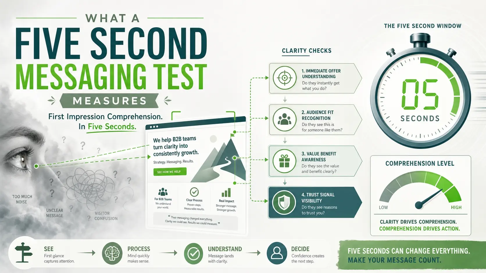
A five second messaging test checks whether a person can quickly tell what you do, who it is for, and why it matters. It focuses on first impression comprehension, not deep evaluation. That distinction makes it useful for websites, landing pages, ads, and even sales decks.
The goal is not to impress with cleverness. The goal is to reduce mental effort so the right people feel oriented fast. When orientation happens, the next click, scroll, or question becomes more likely.
- Immediate Clarity: Whether the offer is understandable without extra context.
- Audience Fit: Whether viewers recognize that it is meant for people like them.
- Value Recognition: Whether the main benefit is apparent, not buried.
- Trust Signals: Whether anything visible increases confidence enough to keep going.
Once you know which of these breaks down, you can fix the right layer instead of rewriting everything.
Why Five Seconds Matters For Brand Comprehension?
Five seconds is long enough to read a headline, scan a subheadline, and notice a visual cue or two. It is also short enough to reveal whether your message stands on its own. If it only makes sense after careful reading, many visitors will leave before they get there.
This test also protects you from internal bias. Teams live with their brand every day, so they fill in gaps automatically. Real prospects cannot do that, and the five second window exposes what is missing.
How To Run The Messaging Test Without Overcomplicating It?
You need a single screen and a small set of questions. Use one view at a time, such as your homepage hero, a product landing page above the fold, a core service page, or a key ad variant. Keep the test consistent so results can be compared across iterations.
- Choose One Primary Asset: Capture the exact view people see first, including headline, subheadline, primary visual, and main call to action.
- Define The Job To Be Done: Decide the one action you want next, such as book a call, request pricing, or explore features.
- Recruit The Right Viewers: Aim for people close to your target audience rather than coworkers, friends, or current customers.
- Show The Screen Briefly: Limit exposure to about five seconds, then remove it fully before asking questions.
- Ask A Short Set Of Questions: Collect responses without guiding language so you capture what they truly understood.
- Group And Score Responses: Categorize answers by themes and measure how often the intended message appears.
With this structure, you can run the test quickly and still get insight that leads to actionable edits.
Questions That Reveal What People Actually Understood
The questions you ask determine whether you get clarity or noise. Keep them open ended so people use their own words, then add one or two structured questions for scoring. Avoid prompting with your internal terms, since that masks confusion.
- What Do You Think This Company Does: Look for specific, accurate descriptions rather than vague categories.
- Who Do You Think This Is For: Check whether they name your intended audience or a different one.
- What Stood Out Most: Identify whether they remember the value, a feature, a buzzword, or the visual.
- What Would You Do Next: See whether the call to action is obvious and appropriate for the stage.
- How Confident Are You In Your Answer: Low confidence signals friction even when answers are correct.
These responses make it easier to decide whether to change your message, your layout, or your proof points.
Common Failure Patterns And What They Indicate?
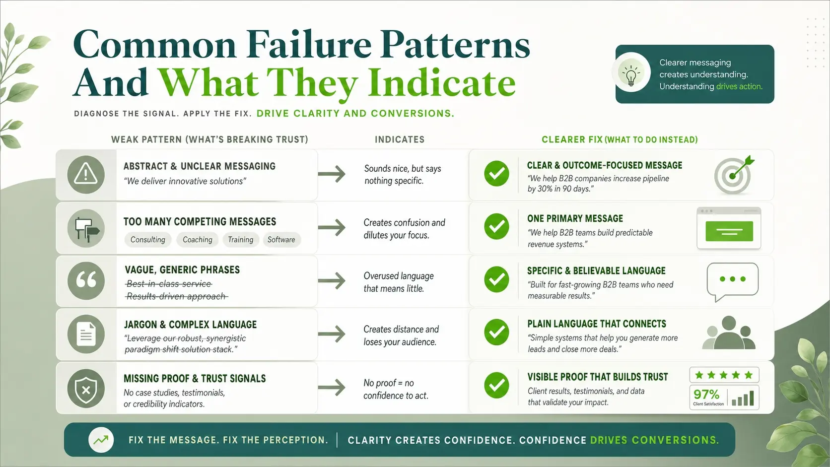
Most weak results fall into a few recognizable patterns. When you map the pattern to a cause, fixes become faster. You also avoid chasing cosmetic changes that do not improve comprehension.
- Too Many Offers Competing: Visitors cannot tell which product or service is primary, so they default to leaving.
- Generic Benefits: Phrases like efficient, innovative, or high quality do not explain the real outcome.
- Industry Jargon: Internal language forces translation work, especially for first time buyers.
- Missing Context Cues: Without a clear audience marker, people do not know whether it applies to them.
- Proof Hidden Or Absent: Visitors understand the claim but do not believe it without visible trust signals.
Fixing these usually improves bounce rate, scroll depth, and qualified inquiries without increasing traffic.
Messaging Elements To Tighten First
Start with the elements that carry the most meaning in the shortest space. The headline should state what you deliver and the outcome, not your philosophy. The subheadline should add specificity such as who it is for or how it works, in simple language.
Then check your primary visual and call to action. Visuals should clarify the offer, not distract from it. The call to action should match intent, with lower friction language early and higher commitment actions later.
- Headline: Lead with outcome and category so people self qualify quickly.
- Subheadline: Add audience, approach, or differentiator in one short sentence.
- Primary Visual: Reinforce the promise with product context, results context, or process context.
- Trust Signals: Include concise proof such as client types, certifications, security notes, or measurable outcomes.
- Call To Action: Make the next step obvious and aligned with what the page offers.
After these are solid, supporting sections like feature grids and long copy typically become easier to write and more convincing.
A Simple Scoring Framework You Can Use
Scoring helps you compare versions and prevents subjective debates. Keep it lightweight and consistent. You can score each response against three essentials and one supporting factor.
| Scoring Area | What A Strong Response Includes | Quick Fix If It Is Weak |
|---|---|---|
| What You Do | Clear category and outcome in plain words | Rewrite headline to name the offer and result |
| Who It Is For | Specific audience or use case | Add audience marker in subheadline |
| Why It Matters | Benefit tied to a real business or personal goal | Replace generic benefits with concrete outcomes |
| Trust And Next Step | Confidence plus an appropriate action | Add proof near the top and simplify the call to action |
Use the table as a repeatable checklist. When you improve one area, retest before changing something else.
How This Fits Into A Broader Brand And Website Strategy?
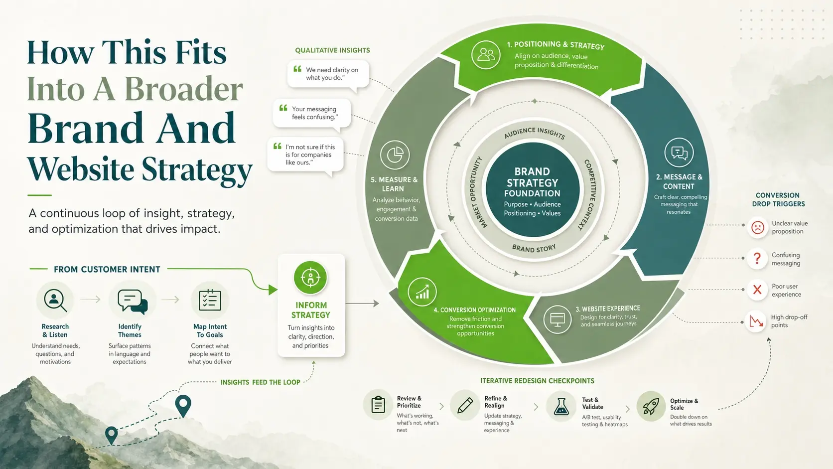
A messaging test is most powerful when it is part of an ongoing optimization loop. Run it before a redesign, after a new positioning decision, and whenever conversion drops. It also pairs well with qualitative insights from sales calls and support tickets because it shows what people miss before they engage.
If your organization needs help aligning positioning, website structure, and conversion focused copy, a strategic partner can speed up the process. IMILI Corp supports brands with web strategy, performance oriented design, and clear messaging that reflects real customer intent, so improvements are not limited to surface level wording.
What To Do After You Collect Results?
Do not rewrite the entire page based on a few comments. Look for patterns, then apply the smallest change that addresses the biggest confusion. Retest quickly so you know whether the change worked.
- Cluster Responses By Theme: Group similar misunderstandings so you can identify the dominant issue.
- Choose One Primary Edit: Update the headline, subheadline, or proof first, not all at once.
- Reduce Cognitive Load: Remove extra claims, tighten sentences, and prioritize the main promise.
- Improve Visual Hierarchy: Make the main message larger and earlier than supporting details.
- Retest And Compare Scores: Use the same questions and scoring so the change is measurable.
This approach creates steady gains while keeping your brand voice consistent.
Conclusion
When customers understand your brand quickly, they are more likely to stay, explore, and take the next step. A five second messaging test gives you a fast, reliable way to find gaps in clarity, relevance, and trust. Run it on the most visible parts of your site, fix one high impact element at a time, and keep testing until the intended message is what people repeat back.
Frequently Asked Questions
How Many People Should Take A Five Second Messaging Test?
Small tests can work, but aim for enough responses to see patterns rather than outliers. A practical range is often 10 to 20 people per page version, focused on your target audience. If results are mixed, increase the sample before making bigger changes.
Should I Test My Homepage Or A Landing Page First?
Start with the page that receives the most first time visits or has the highest business impact. For many brands, that is the homepage hero or a core service landing page. Prioritize the page tied most directly to leads, demos, or purchases.
What If People Understand The Offer But Still Do Not Convert?
That usually points to a trust, friction, or offer alignment issue rather than clarity. Add proof near the top, simplify the next step, and ensure the call to action matches buyer readiness. If clarity is strong, focus next on objections, pricing transparency, and form or checkout friction.